Introduction
The aim of PERK is to predict and visualize concentrations of pharmaceuticals in the aqueous environment.
PERK acronym for Predicting Environmental concentration and RisK, is an R/Shiny application tool, aims to facilitate automated modelling and reporting of predicted environmental concentrations of a comprehensive set of pharmaceuticals derived from a wide range of therapeutic classes with different mode of action.
The tool helps users,
- to input their measured concentration,
- to compare the predicted and measured concentrations of the APIs by means of the PEC/MEC ratio,
- to establish whether the predicted equations used tend to underestimate or overestimate measured values.
- It provides a consistent interactive user interface in a familiar dashboard layout, enabling users to visualise predicted values and compare with their measured values without any hassles.
- Users can download data and graphs generated using the tool in .csv or publication ready images (.pdf, .eps).
Data sources:
Prescription Data For England:
This tool uses the prescription data from PrAna, an R package to calculate and visualize England NHS prescribing data.
The data used in PrAna are as follows,
Prescribing data and Practice information are from the monthly files published by the NHS Business Service Authority, used under the terms of the Open Government Licence.
BNF codes and names are also from the NHS Business Service Authority’s Information Portal, used under the terms of the Open Government Licence.
dm+d weekly release data is also from the NHS Business Service Authority’s Information Portal, used under the terms of the Open Government Licence.
WWTP Data:
The following dataset are provided from WWTP collaborators,
Catchment map used to define the boundaries and capture the GP Practices inside the catchments for the prescription data calculations.
Daily flow data used to calculate the load and population equivalent.
Population Equivalent number of inhabitants per catchment zone.
Site information required to predict information such as recovery percentage.
Water quality parameters to predict population equivalent.
API properties
- Metabolites and Excretion factors collected from research articles and data repositories such as Drug bank.
- Recovery percentage collected from research articles, calculated from measured concentration from previous experiments, predicted using WWTP site information.
- Physio-chemical properties collected from research articles and data repositories.
- Site information required to predict information such as recovery percentage.
- Eco-toxicity data collected from research articles and data repositories.
Workflow
The workflow in this tutorial consists of the following steps, as in the Figure 1.
Upload Data: Download template for the dataset and upload in the corresponding input holders.
Analysis and Visualisation (AV) Panel: Click on the relevant analysis and visualisation panel. PERK features three AV panels (1) Predicted, (2) Measured, (3) Predicted vs Measured.
Analysis and Visualisation settings (AVS): Click respective analysis and visualisation setting (AVS) tab, to select the option to analyse and visualise datatable/plot
Plot settings: Click on the plot settings such as, color and line width for the better/suitable visualisation.
Download data: Click on the download buttons to download generated plot/data in publication friendly .pdf/.eps or .csv files.
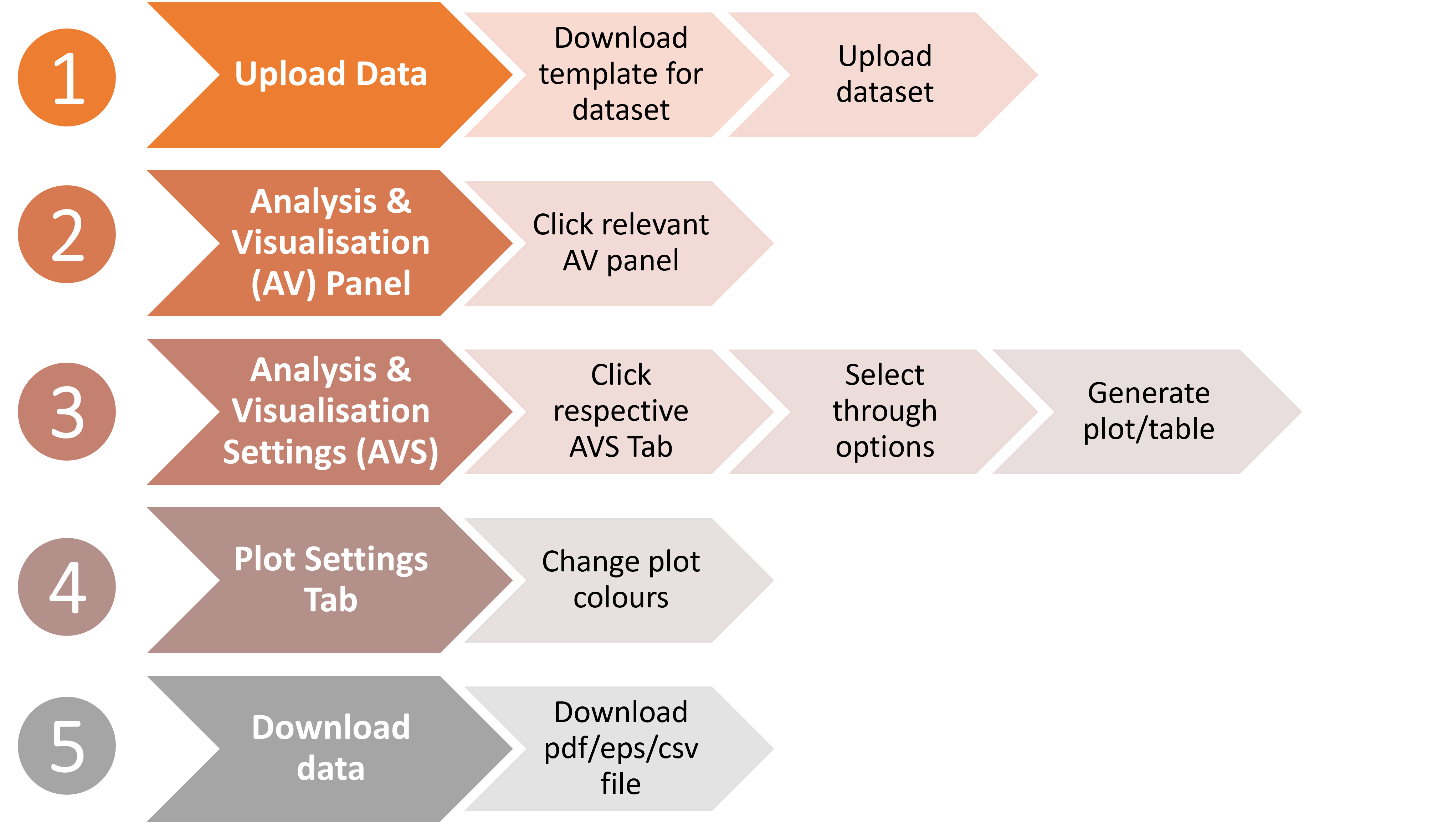
Figure 1: PERK Workflow
PERK Features
-
PERK consist of several features, broadly categorized as three panels
- Upload Data
- Predicted
- Measured
- Predicted vs Measured
Overview of the individual panels and their options can be found in Figure 2 and will be discussed in the following sections.
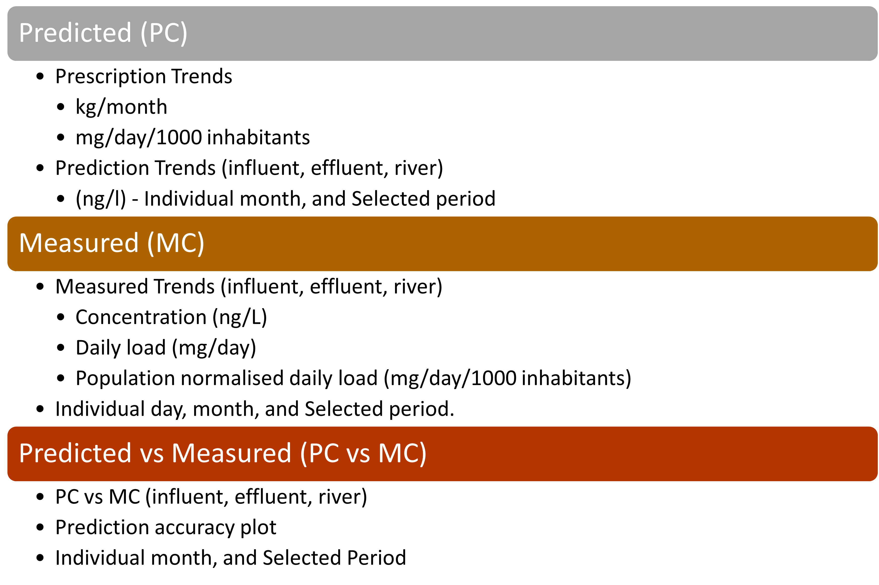
Figure 2. PERK: Features
Upload Data
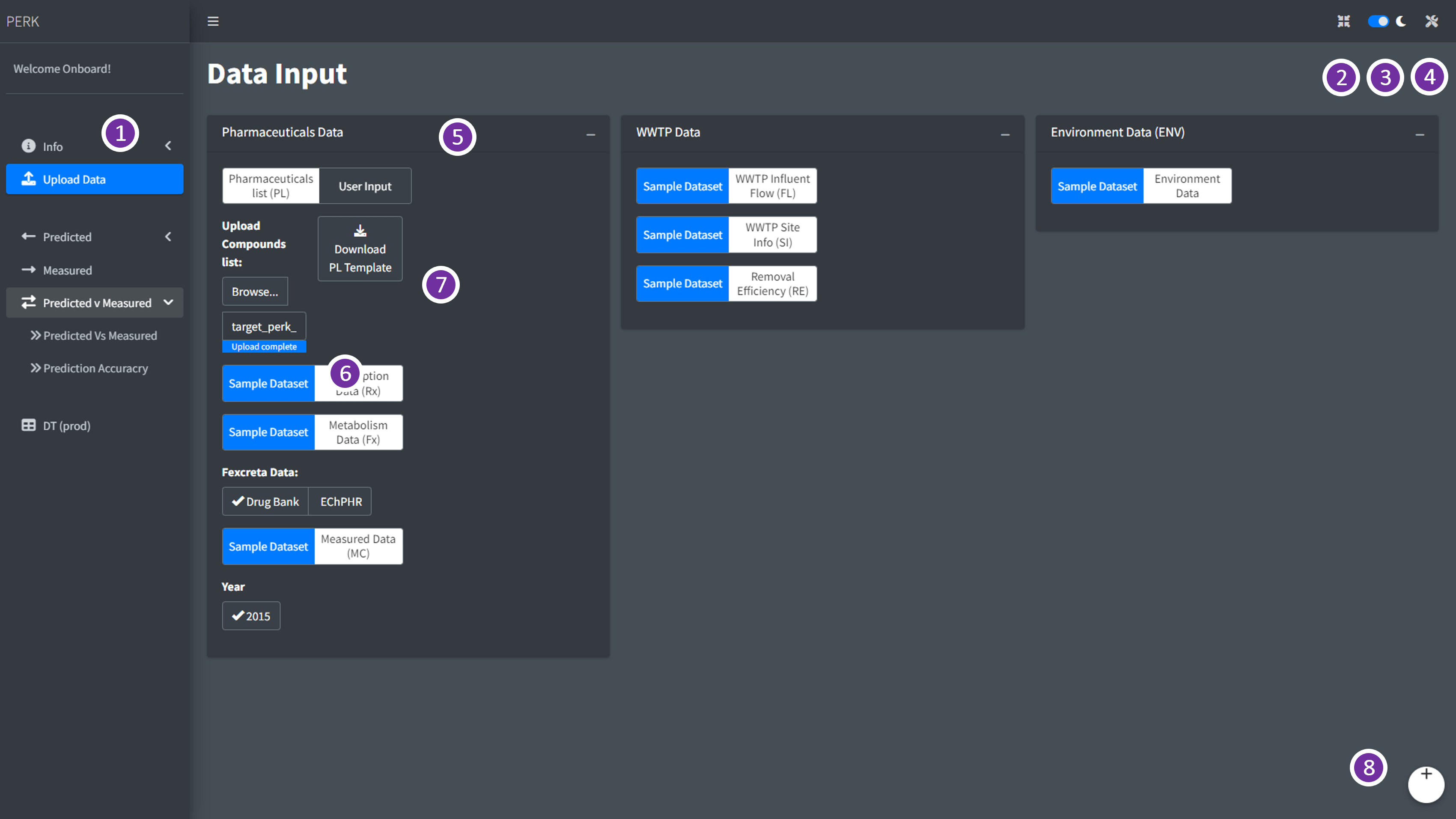
Figure 3. PERK: Upload Data
| Part | Remarks |
|---|---|
| 1 | Analysis and Visualisation (AV) Panel |
| 2 | Full screen |
| 3 | Dark and Light mode |
| 4 | Plot settings |
| 5 | Data selection Area |
| 6 | Upload File Button |
| 7 | Download Template for the file |
| 8 | User Logout |
- In this panel, user can
Download templatefor the dataset and upload in the corresponding input holders as in Figure 3. - User can click on the
Download templatebutton to generate the comma separated value (.csv) file. - Once the template is downloaded, user can add in or convert their dataset to corresponding template and upload it in the corresponding input holders to do the analysis and visualisation.
Predicted (PC)
- Predicted (PC) panel, has two sub-panels
- Prescription: to analyse and visualise the prescription trends and
- Predicted Concentrations: to analyse and visualise the prediction trends based on user inputs.
Predicted: Prescription
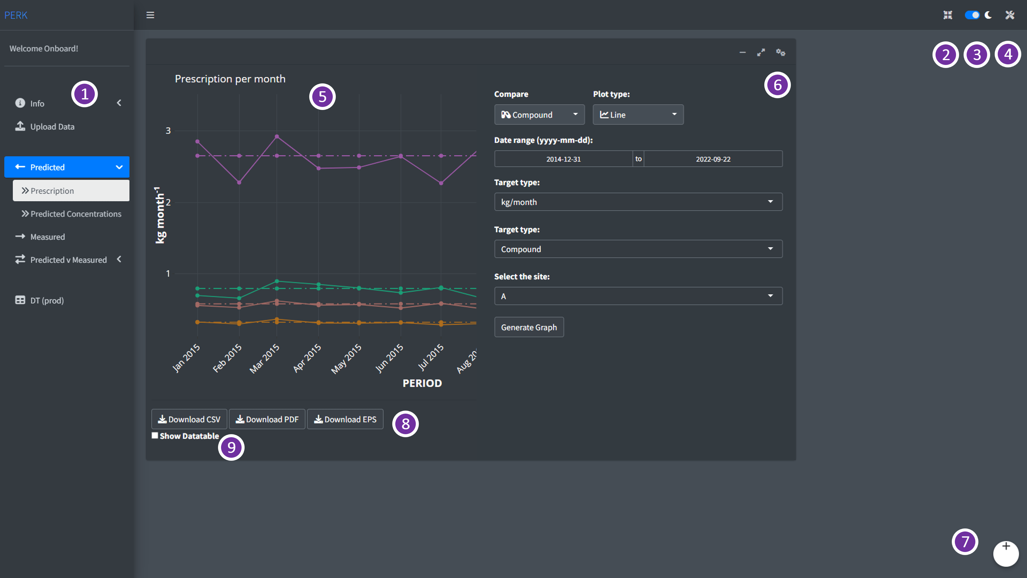
Figure 4. Predicted: Prescription - AV Panel.
Different parts of the
Predicted: Prescriptionsub-panel andPERKdashboard is highlighted in the Figure 4 and listed in the Table 2.In Prescription sub-panel, user can select the period of their interest using the
Data Rangeoption, and select prescription type (raw or population normalized) value usingTarget typeand the site usingSelect the siteoptions in the analysis and visualisation settings (AVS) tab, as in Figure 4
| Part | Remarks |
|---|---|
| 1 | Analysis and Visualisation (AV) Panel |
| 2 | Full screen |
| 3 | Dark and Light mode |
| 4 | Plot settings |
| 5 | Plot generated based on user selection |
| 6 | Analysis and Visualisation settings (AVS) panel |
| 7 | User log-out |
| 8 | Download buttons to download the generated plot as .pdf or .eps and data as .csv format |
| 9 | Show Datatable |
Prescription trends in the Predicted (PC) panel, can generate long-term month wise raw prescription trends (kg/month), as in Figure 5 and population normalized daily loads based on prescription (PNDP) (mg/day/1000 inhabitants) as in Figure 6 .
User can download the generated plot as publication-friendly images in .pdf/.eps format, user can also download the images in .png format and data generated for the plot as .csv file using the download buttons present below the plot.
-
User can view the data table by checking the
Show Datatablecheck box present below the download buttons.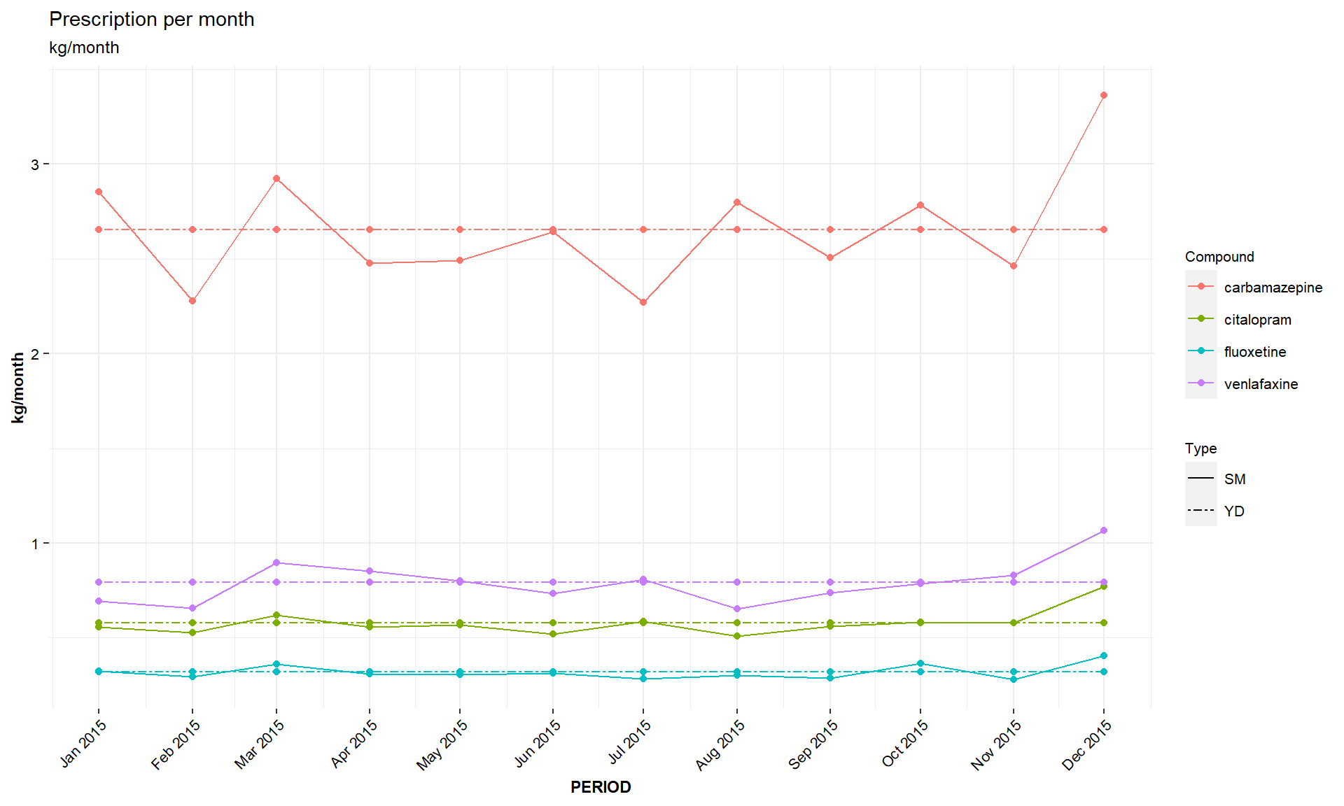
Figure 5. PC: kg/month.
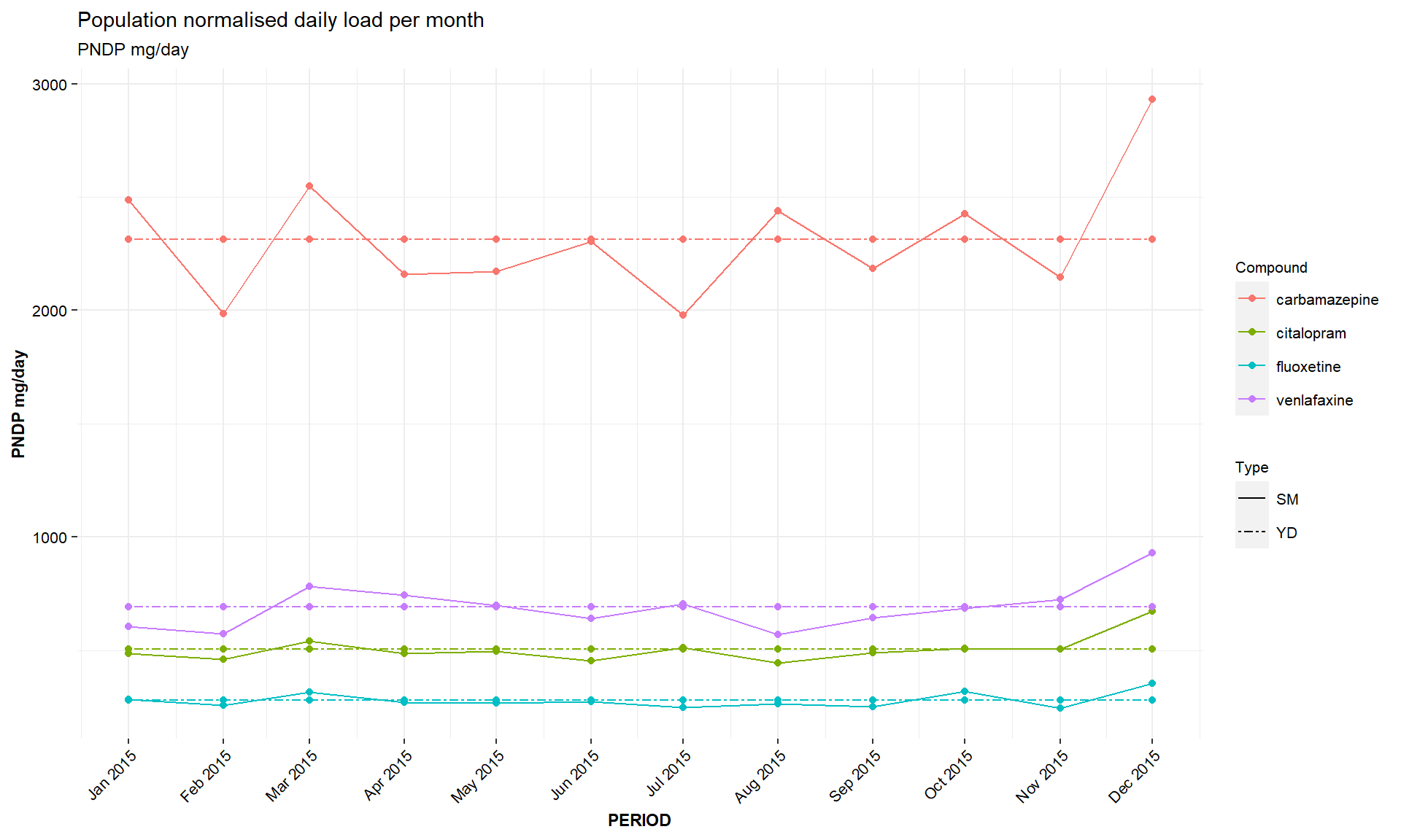
Figure 6. PC: PNDP.
Predicted: Predicted Concentration
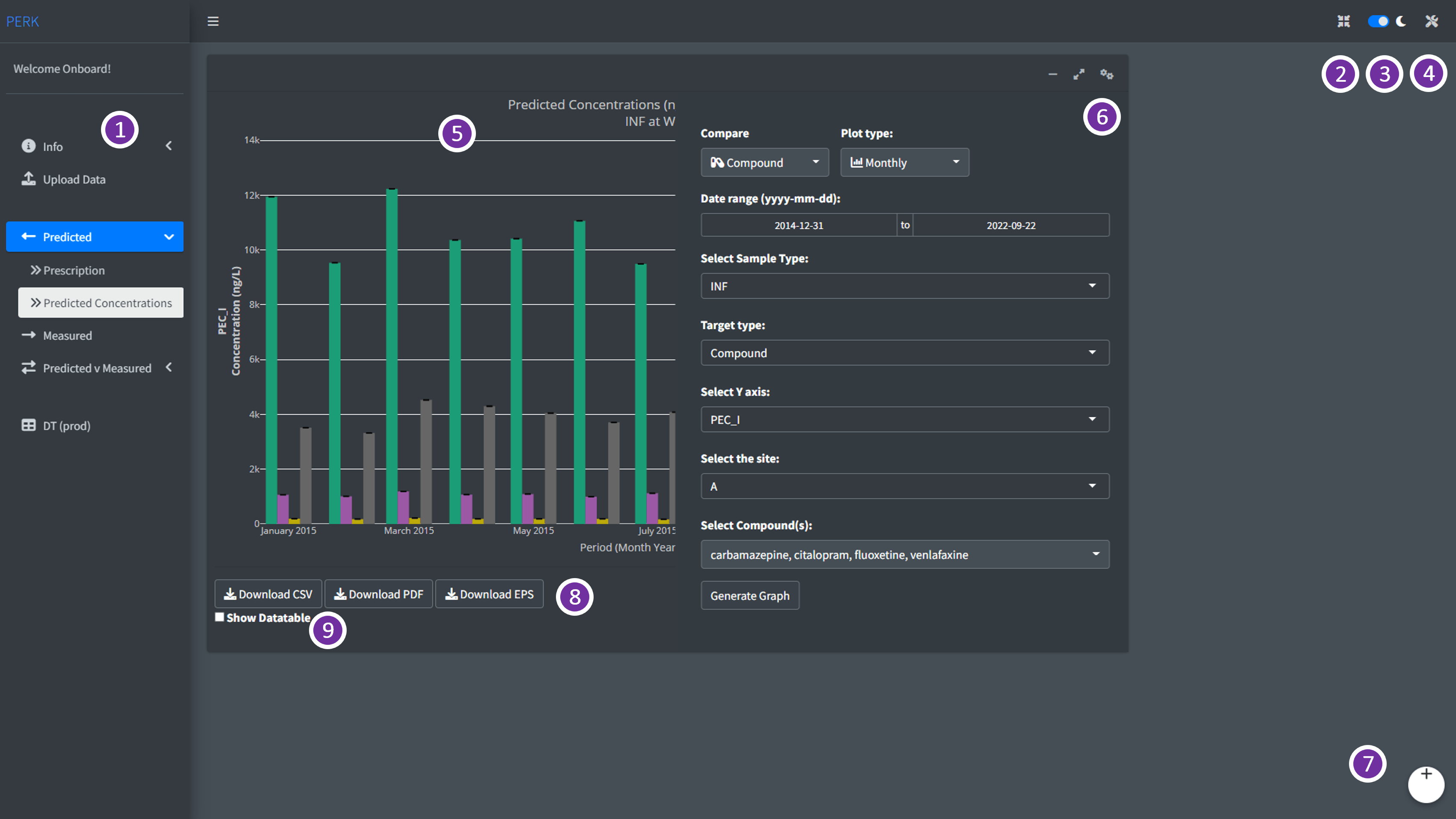
Figure 7. Predicted: Predicted Concentrations - AV Panel.
- Different parts of the
Predicted: Predicted Concentrationssub-panel andPERKdashboard is highlighted in the Figure 7 and listed in the Table 3.
| Part | Remarks |
|---|---|
| 1 | Analysis and Visualisation (AV) Panel |
| 2 | Full screen |
| 3 | Dark and Light mode |
| 4 | Plot settings |
| 5 | Plot generated based on user selection |
| 6 | Analysis and Visualisation settings (AVS) panel |
| 7 | User log-out |
| 8 | Download buttons to download the generated plot as .pdf or .eps and data as .csv format |
| 9 | Show Data table |
In the predicted concentrations sub-panel, user can select the period of their interest using the
Data Rangeoption, and select prediction sample type (wastewater influentINF, wastewater effluentEFFand riverRDOWN) usingSample typeand the site usingSelect the siteoptions in the analysis and visualisation settings (AVS) tab, as in Figure 7-
Two types of prediction values can be visualised in this panel based on the prescription data,
-
PEC_I: This prediction considers prescription based on individual month, -
PEC_II: This prediction is based on the prescription per year.
-
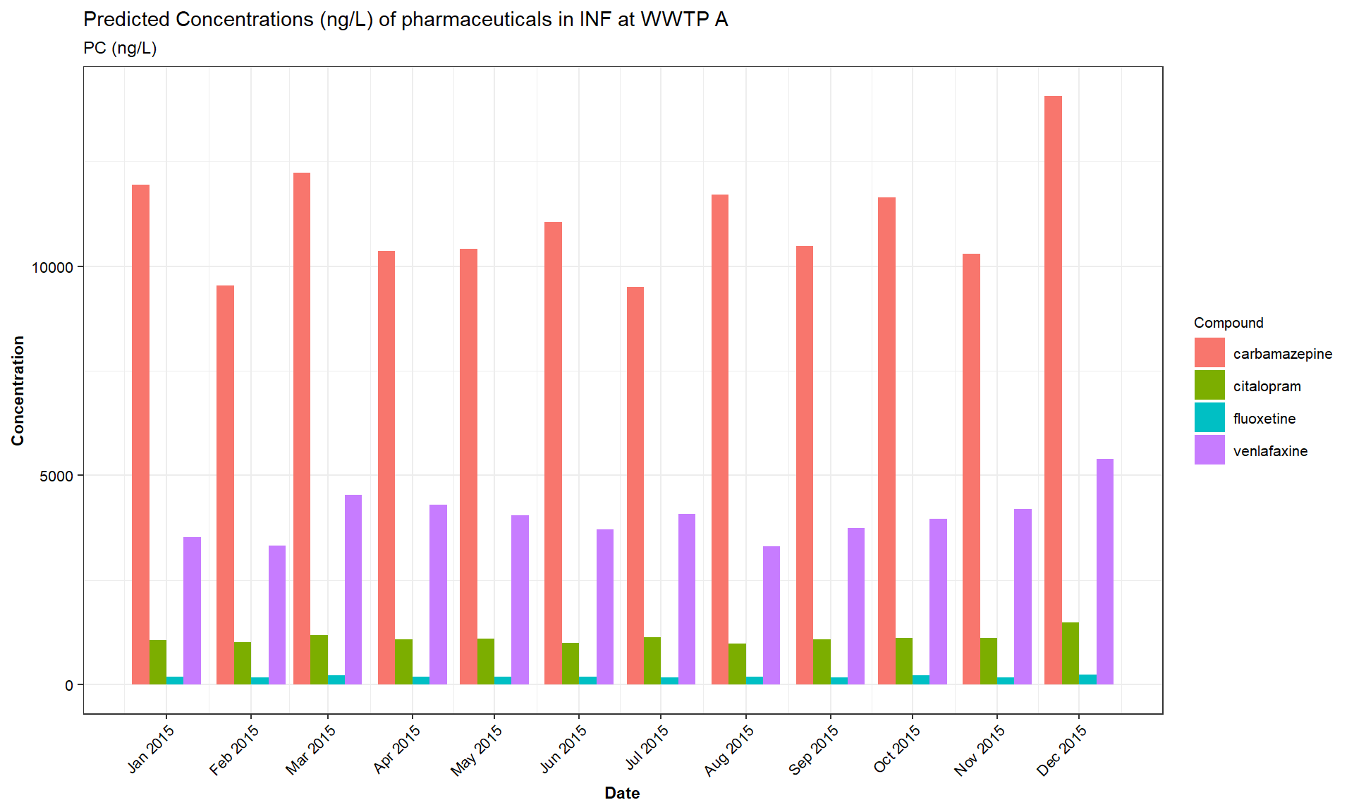
Figure 8. PC: concentration/month.
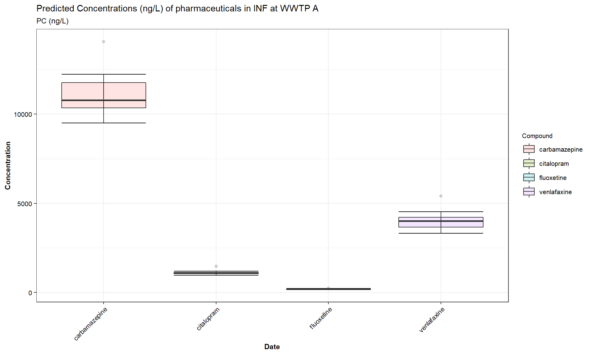
Figure 9. PC: concentration/period.
This panel visualise prediction per month for the selected period
(ng/L)as in the Figure 8, and total prediction per selected period(ng/L), as in the Figure 9In addition, this panel also enables to compare month wise and total predicted concentration of selected pharmaceuticals over different environmental matrices, such as,
INF,EFFandRDOWNand compare over different WWTPs in the study.User can download the generated plot as publication-friendly images in .pdf/.eps format, user can also download the images in .png format and data generated for the plot as .csv file using the download buttons present below the plot.
User can view the data table by checking the
Show Datatablecheck box present below the download buttons.
Measured (MC)
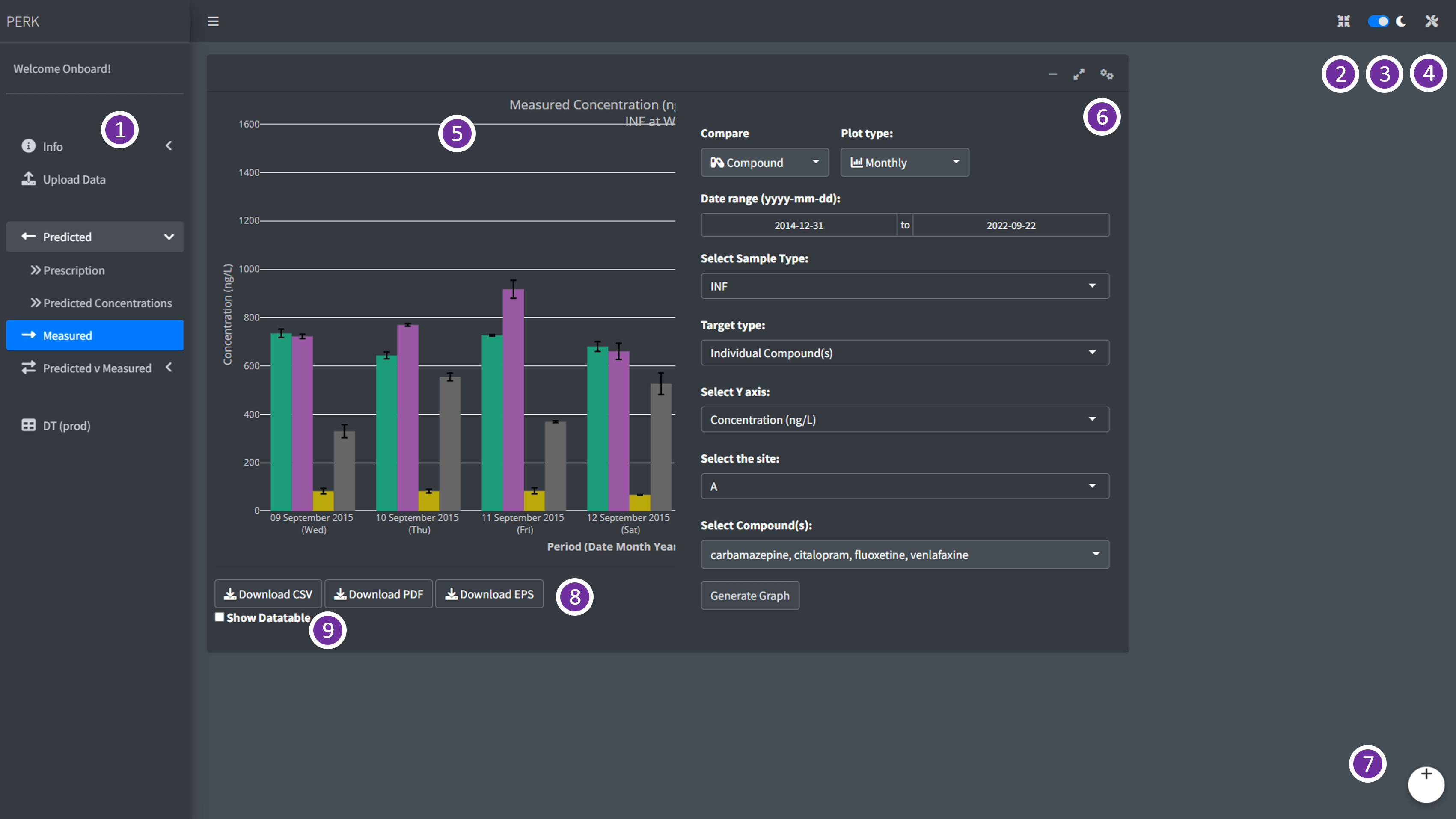
Figure 10. Measured: Measured Concentrations - AV Panel.
- Different parts of the
Measuredtab andPERKdashboard is highlighted in the Figure 10 and listed in the Table 4.
| Part | Remarks |
|---|---|
| 1 | Analysis and Visualisation (AV) Panel |
| 2 | Full screen |
| 3 | Dark and Light mode |
| 4 | Plot settings |
| 5 | Plot generated based on user selection |
| 6 | Analysis and Visualisation settings (AVS) panel |
| 7 | User log-out |
| 8 | Download buttons to download the generated plot as .pdf or .eps and data as .csv format |
| 9 | Show Datatable |
In
Measuredpanel as in the Figure 10, user can select the period of their interest using theData Rangeoption, and select sample matrix type (INF- wastewater influent,EFF- wastewater effluent,RDOWN- River Downstream,RUP- River upstream,SPM- Solids) usingSample type, based on the user input dataset.User can select the measurement type (Concentration, DL - Daily Load, PNDL - Population normalised daily load) using
Measurement Type, and the site bySelect the siteoptions in the analysis and visualisation settings (AVS) tab, as in Figure 10User can download the generated plot as publication-friendly images in .pdf/.eps format, user can also download the images in .png format and data generated for the plot as .csv file using the download buttons present below the plot.
User can view the data table by checking the
Show Datatablecheck box present below the download buttons.
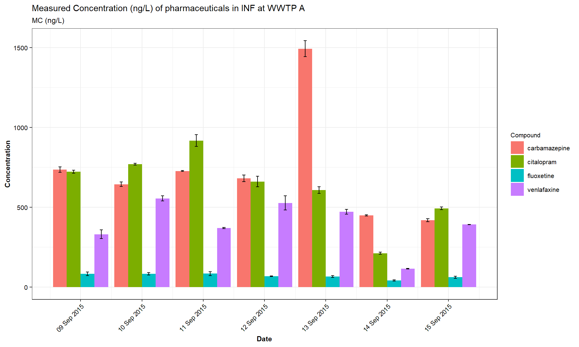
Figure 11. MC: concentration/month.
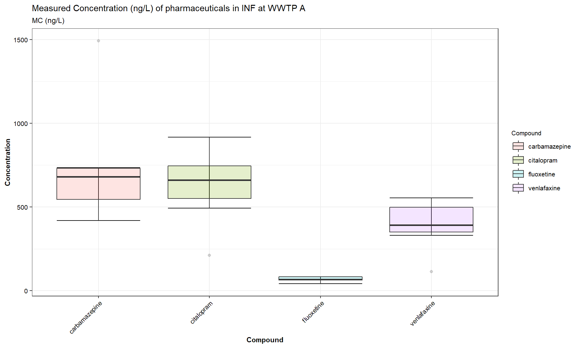
Figure 12. MC: concentration/period.
-
Three types of measured values can be visualised in this panel based on the measurement data uploaded by the user,
-
Concentration (ng/L): This is the raw concentration values based on individual measurements.
-
DL (mg/day): This is the Daily Load (DL) values based on measurments normalised with the daily flow of wastewater for theINFandEFF, and river for theRDOWNandRUP. -
PNDL (mg/day/1000 inhabitants): This is the Population Normalised Daily Load values calculated based on the population in the WWTP catchment and the daily flow.
-
This panel visualise measurement per month for the selected period
(ng/L)as in the Figure 11, and total measurement per selected period(ng/L), as in the Figure 12
Predicted vs Measured
- Predicted vs Measured (PC vs MC) panel, has two sub-panels
- Predicted vs Measured: to analyse and visualise the predicted trends vs measured trends and
- Prediction Accuracy - PA: to analyse and visualise the prediction accuracy.
Predicted vs Measured: Predicted vs Measured
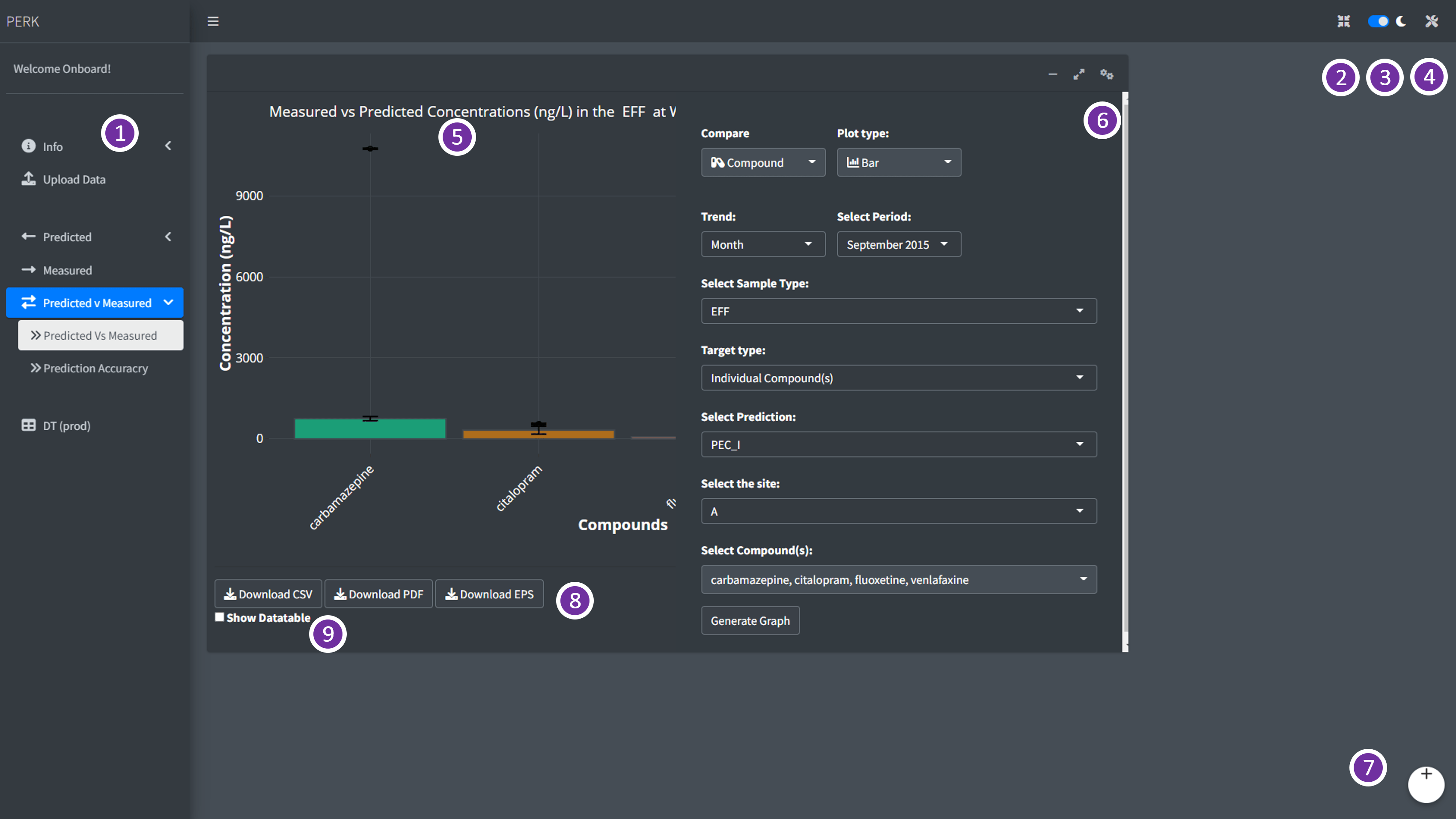
Figure 13. Predicted vs Measured: Predicted vs Measured - AV Panel.
- Different parts of the
Predicted vs Measured: Predicted vs Measuredsub-panel andPERKdashboard is highlighted in the Figure 13 and listed in the Table 5.
| Part | Remarks |
|---|---|
| 1 | Analysis and Visualisation (AV) Panel |
| 2 | Full screen |
| 3 | Dark and Light mode |
| 4 | Plot settings |
| 5 | Plot generated based on user selection |
| 6 | Analysis and Visualisation settings (AVS) panel |
| 7 | User log-out |
| 8 | Download buttons to download the generated plot as .pdf or .eps and data as .csv format |
| 9 | Show Datatable |
In
Predicted vs Measuredsub-panel, user can select the period of their interest using theSelect Periodoption, and select sample type (wastewater influentINF, wastewater effluentEFFand riverRDOWN) usingSelect Sample typeand the site usingSelect the siteoptions in the analysis and visualisation settings (AVS) tab, as in Figure 13Predicted vs Measured trends in the
Predicted vs Measured(PCvsMC) panel, can generate measured concentration vsPEC_IandPEC_II, predictions based on monthly prescription as in Figure 14 and prediction based on the prescription per year Figure 15 respectively.
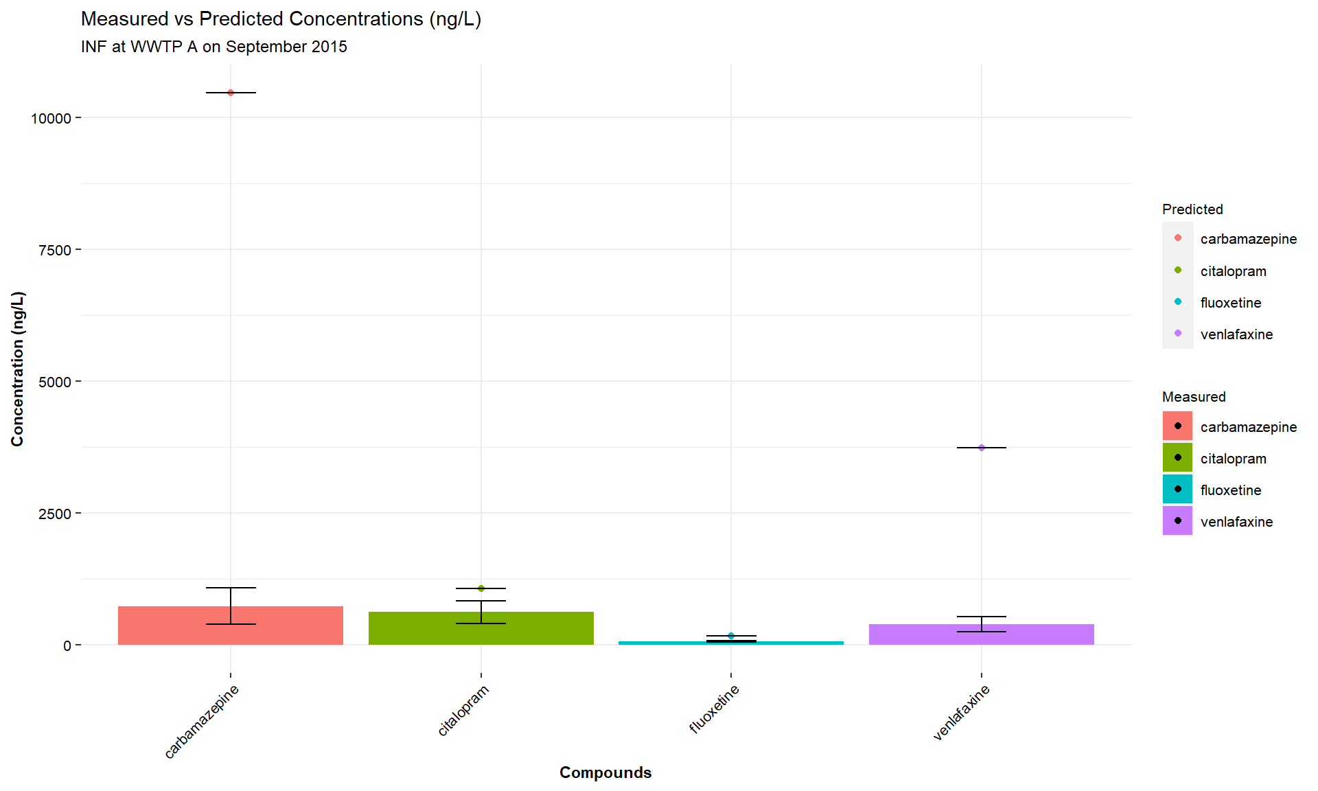
Figure 14. PCvsMC: PEC-I.
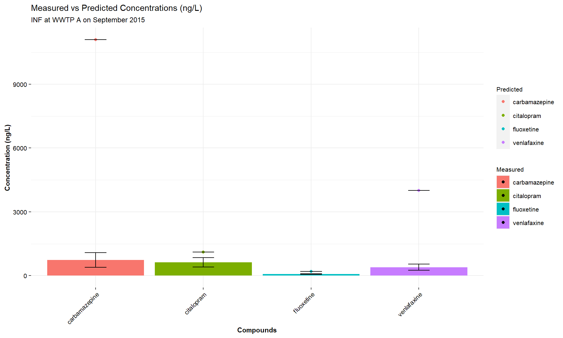
Figure 15. PCvsMC: PEC-II.
User can download the generated plot as publication-friendly images in .pdf/.eps format, user can also download the images in .png format and data generated for the plot as .csv file using the download buttons present below the plot.
User can view the data table by checking the
Show Datatablecheck box present below the download buttons.
Predicted vs Measured: Prediction Accuracy
- Different parts of the
Predicted vs Measured: Prediction Accuracysub-panel andPERKdashboard is highlighted in the Figure 16 and listed in the Table 6.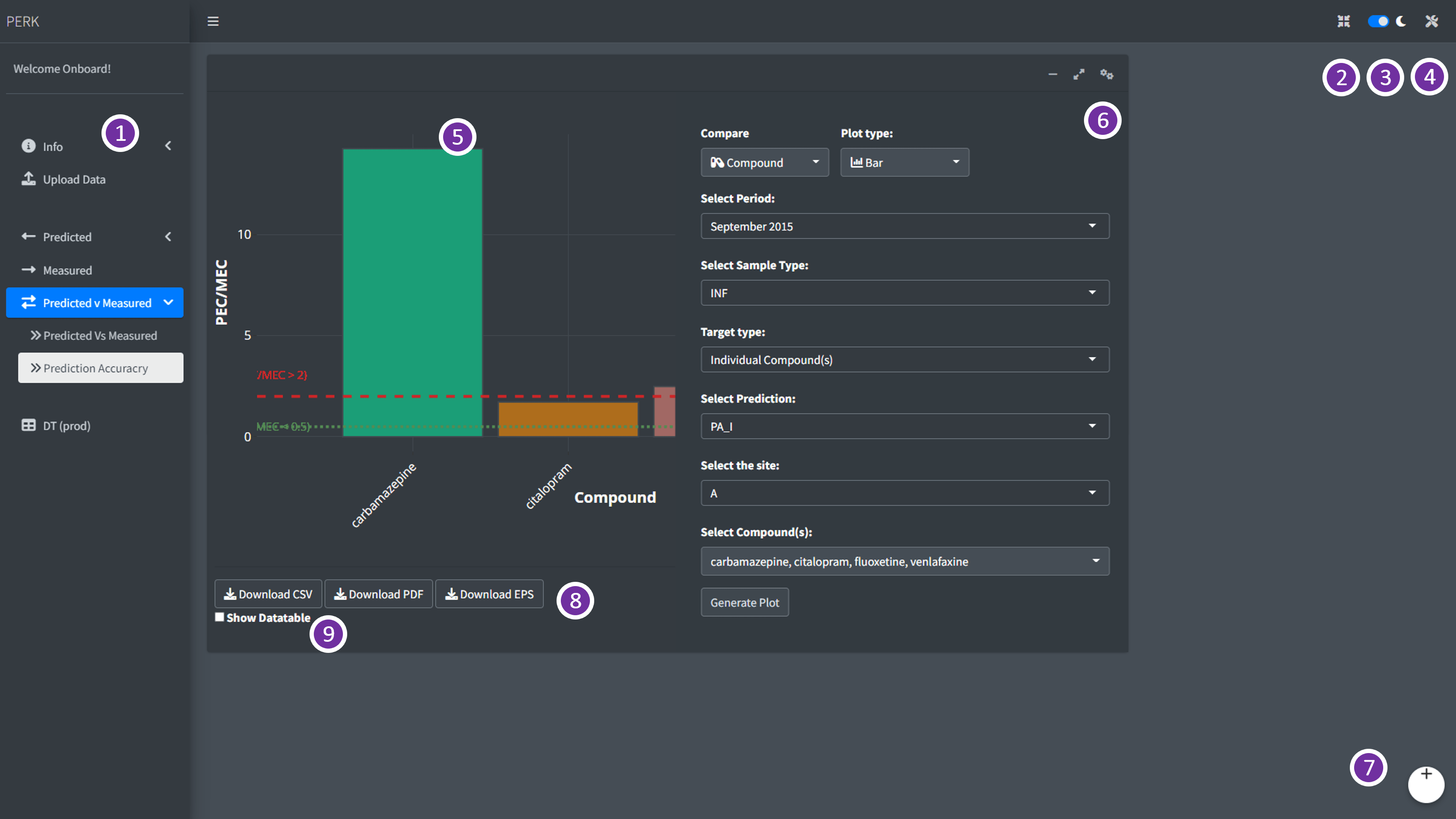
Figure 16. Predicted vs Measured: Prediction Accuracy - AV Panel.
| Part | Remarks |
|---|---|
| 1 | Analysis and Visualisation (AV) Panel |
| 2 | Full screen |
| 3 | Dark and Light mode |
| 4 | Plot settings |
| 5 | Plot generated based on user selection |
| 6 | Analysis and Visualisation settings (AVS) panel |
| 7 | User log-out |
| 8 | Download buttons to download the generated plot as .pdf or .eps and data as .csv format |
| 9 | Show Datatable |
- In
Prediction Accuracysub-panel, user can select the period of their interest using theSelect Periodoption, and select sample type (wastewater influentINF, wastewater effluentEFFand riverRDOWN) usingSelect Sample typeand the site usingSelect the siteoptions in the analysis and visualisation settings (AVS) tab, as in Figure 16 - Prediction Accuracy trends in the
Prediction Accuracy(PA) panel, can generate trends inPA_IandPA_II, predictions based on monthly prescription as in Figure 17 and prediction based on the prescription per year respectively.
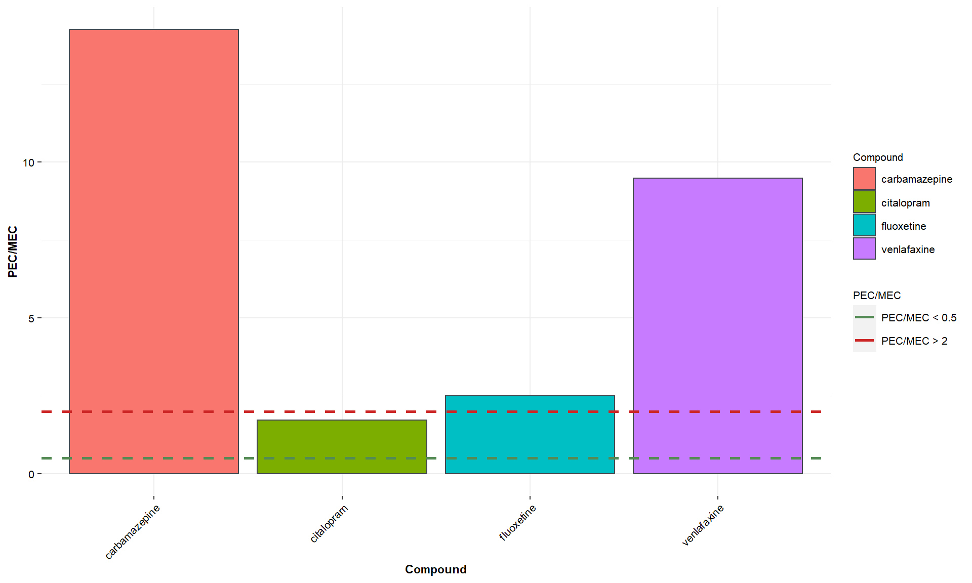
Figure 17. PCvsMC: PA-I.
User can download the generated plot as publication-friendly images in .pdf/.eps format, user can also download the images in .png format and data generated for the plot as .csv file using the download buttons present below the plot.
User can view the data table by checking the
Show Datatablecheck box present below the download buttons.